
When I first built the tool, I made every classic mistake in the book. Every feature I could imagine? Included. Every metric I could display? On screen. Every option a user might conceivably want? Accessible from the main interface.
The result was a tool that technically did everything - and practically did nothing well.

The Temptation of "Just One More Feature"
Building a product is intoxicating. When you're deep in development mode, every idea feels essential. You think, "Users will definitely want to see this metric," or "I should add an option for that edge case."
This is feature creep - and it nearly killed my product before launch.
The domain naming space already has tools that overwhelm users. Registrars show you dozens of TLD variations. Traditional generators spit out hundreds of keyword mashups. The last thing anyone needed was another cluttered interface adding to the noise.
Yet there I was, building exactly that.
What the First Version Looked Like
The early interface was a visual assault disguised as a product. Every metric had its own bright color. Score badges competed for attention with vivid greens, oranges, reds, and blues. The domain name itself - the thing users actually came to see - got lost in a rainbow of visual noise.
- Color-coded everything - each metric screamed for attention with its own bold hue
- Score badges everywhere - numerical ratings cluttered every row
- Detailed breakdowns visible by default - information overload from the start
- No visual hierarchy - the domain names themselves were just another element in the chaos
Users didn't know where to look. The cognitive load was immense. Testing sessions revealed people squinting at the screen, trying to find the actual domain names among all the colorful badges and metrics. The core information they needed - just a clean list of domain suggestions - was buried under layers of visual complexity.
The Pivot: Learning What to Remove
The breakthrough came from an uncomfortable realization: adding features is easy, removing them is hard.
Once something exists in your product, it feels permanent. You've invested time building it. Someone, somewhere might use it. The sunk cost fallacy kicks in.
But here's what I learned from research on feature creep: the best products aren't defined by what they include. They're defined by what they deliberately exclude.
I started asking different questions:
-
Does this help users make a decision? If a feature provided information without aiding the core decision - which domain to register - it was a candidate for removal.
-
Can a first-time user understand this instantly? If explanation was required, the feature needed simplification or elimination.
-
Is this solving my problem or the user's problem? Many features existed because I found them interesting as a developer, not because users needed them.
The Simplification Framework
The restructuring followed what UX researchers call progressive disclosure - showing users only what they need, when they need it.
Phase 1: Define the Core Experience
The tool's job is to help you find a great domain name. That's it. Everything else is supporting detail.
The core experience became:
- Enter what you're building
- See ranked domain suggestions
- Understand why certain names scored higher
- Check availability and pricing
Four steps. That's the spine of the product.
Phase 2: Hide Complexity Behind Interaction
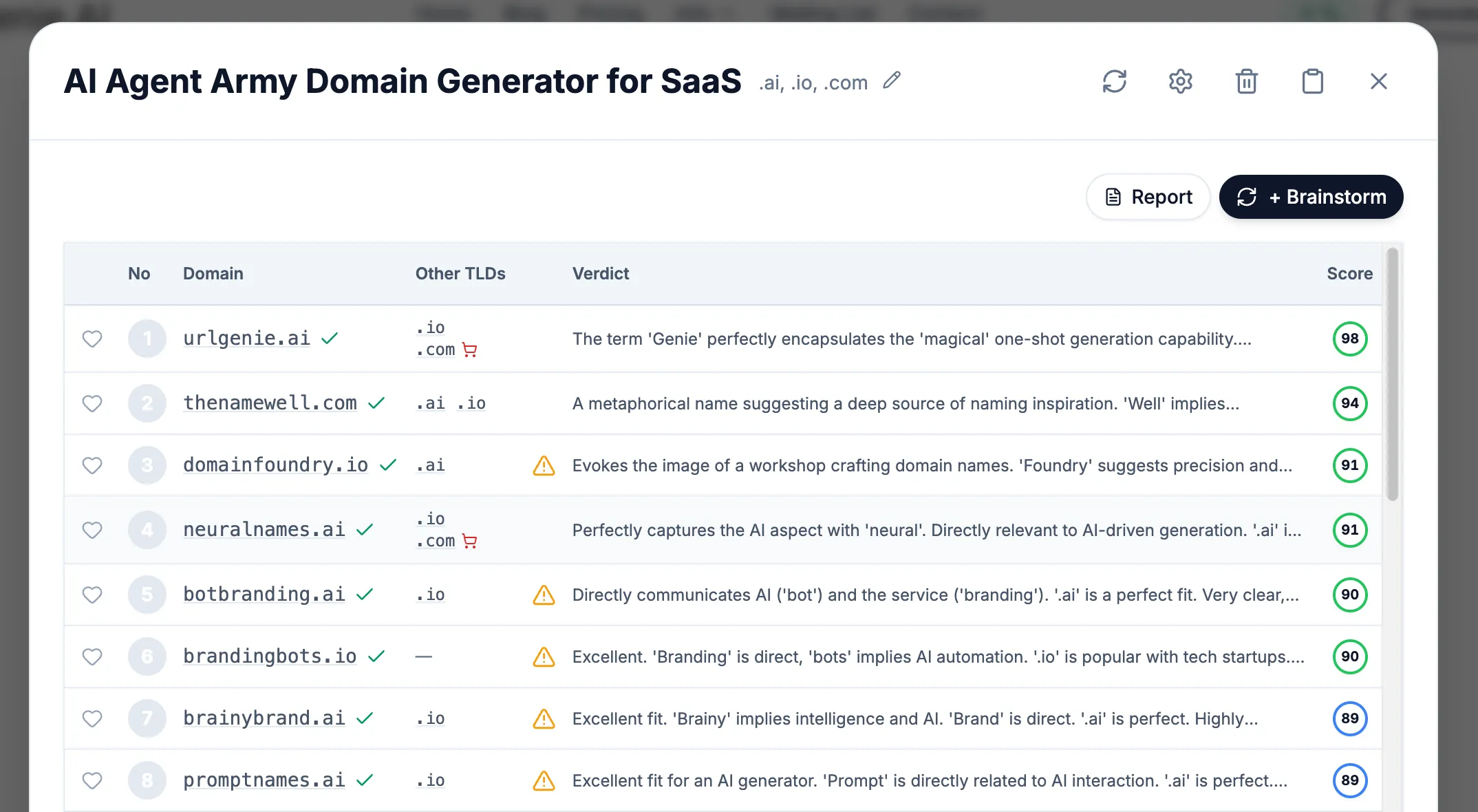
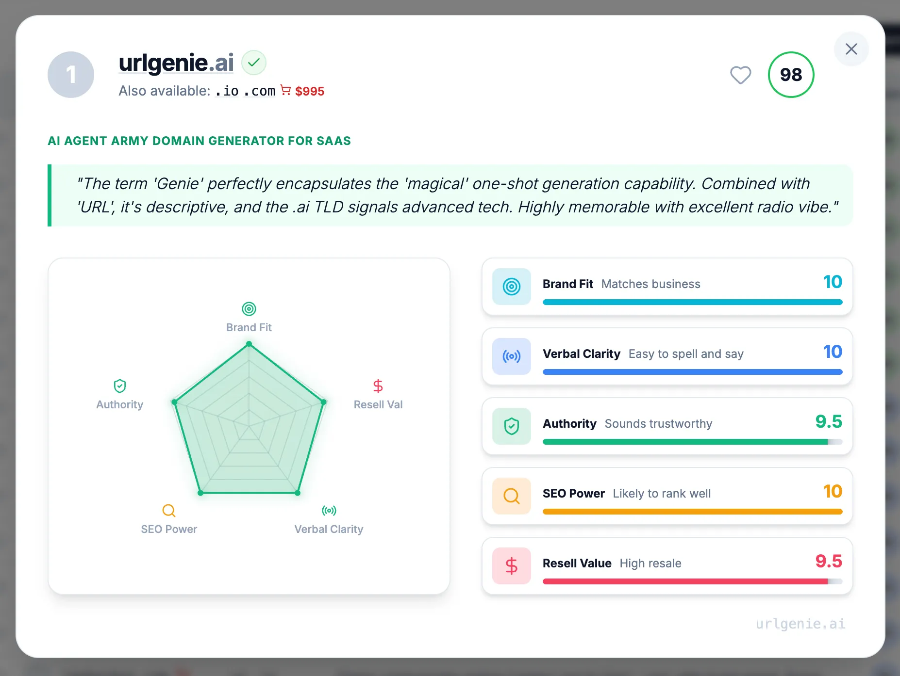
The detailed information didn't disappear - it just moved behind a click. The main results table now shows clean, scannable domain names without the visual noise. When users want deeper analysis, they click on any domain to see a dedicated detail page with the full verdicts, risk analysis, and detailed metrics.
This follows the principle that progressive disclosure reduces cognitive load by revealing information at the moment of relevance, not all at once. Users can now quickly scan the options and make their own judgments based on the domain names themselves, then dive deeper only when they need supporting data.
Phase 3: Stripping the Visual Noise
The biggest change was ruthlessly removing the color chaos from the main results view:
What we removed from the results table:
- Color-coded metric badges competing for attention
- Inline score breakdowns with their rainbow of indicators
- Visual weight that distracted from the domain names themselves
- Busy styling that made the interface feel overwhelming
The result? A clean, professional table where the domain names are the star. Users can actually read and consider each option without visual fatigue. The interface finally respects that users are perfectly capable of judging a domain name themselves - they don't need a kaleidoscope of colors telling them what to think.
All that detailed analysis still exists. It's just one click away on each domain's detail page, where users who want the full breakdown can see every verdict, risk flag, and metric score in context.
The Hard Lesson: Simplicity Requires Courage
Cutting features felt like failure at first. I'd built those systems. They worked. Removing them seemed like admitting I'd wasted time.
But users don't care about your development hours. They care about getting their job done. Every element on screen that doesn't directly serve that goal is a distraction.
The Nielsen Norman Group's research identifies four principles for reducing cognitive load:
- Structure - Organize content to create a clear path
- Transparency - Communicate requirements upfront
- Clarity - Leave no room for ambiguity
- Support - Provide guidance at the right moments
The cluttered version failed all four. The simplified version addresses each.
What Changed After Simplification
The results spoke for themselves:
- The interface looked professional - Without the rainbow of competing colors, the tool felt polished and trustworthy
- Users could actually scan the results - Domain names became readable instead of lost in visual noise
- Navigation became intuitive - Click a domain to see details, that's it
- Nobody missed the clutter - Users appreciated the clean design; nobody asked where all the colors went
The irony? Users didn't notice information was "hidden." They noticed the tool actually worked. The detailed analysis page gives power users everything they need - full verdicts, risk assessments, detailed metric breakdowns - but only when they actively want it.
Ongoing Iteration: The Work Isn't Done
Simplification isn't a one-time event. We continue monitoring:
- What users search for within the tool
- Which features get clicked versus ignored
- Where users pause or backtrack
- What questions support receives
This data drives continuous refinement. Prompts get adjusted. Default views get optimized. The interface evolves based on real behavior, not assumptions about what users might want.
As I discussed in the prompt engineering post, the AI that generates names also required extensive iteration. The same principle applies to the interface: build, observe, refine, repeat.
Practical Lessons for Founders
If you're building a product and struggling with interface complexity, here's what worked for me:
Trust your users' judgment. Don't plaster every screen with scores and indicators. Present information cleanly and let users draw their own conclusions.
Treat visual noise like technical debt. Every color, badge, and indicator has a cognitive cost. Be as ruthless with visual elements as you are with code complexity.
Move details behind interaction. The information users need occasionally shouldn't clutter the main view. A dedicated detail page is better than a cramped results row.
Professional looks simple. If your interface looks busy, it looks amateur. The best tools feel effortless because they strip away everything that doesn't directly serve the user's goal.
Watch where users look. If they're scanning past your colorful metrics to find the actual content, those metrics are hurting, not helping.
The Broader Principle
Building URLGenie taught me something that extends beyond product design: visual complexity is often a failure of confidence.
When I added all those colorful badges and metrics to the main view, I was compensating for not trusting users to evaluate domain names themselves. The rainbow of indicators represented my uncertainty about whether the suggestions were good enough to stand on their own. Stripping them away required confidence that a clean, readable list of domain names - with detailed analysis available on demand - was exactly what users needed.
This lesson applies to naming businesses too. The most effective brand names aren't complex - they're clear. As covered in the complete domain guide, the best domains communicate instantly without explanation.
The interface now reflects the same philosophy we recommend for domains: clear beats clever, simple beats sophisticated.
What's Next
The current interface isn't perfect. We're still learning, still adjusting. But the foundation is solid: present domain names cleanly, let users browse and judge for themselves, and provide detailed analysis when they want to dig deeper.
If you're in the early stages of naming your business or product, the simplified tool is ready to help. A clean table of domain suggestions, with full verdicts and risk analysis just a click away on each domain's detail page.
That's what simplification means in practice: not less capable, but more focused.